Atmalab: Tax Groupware Platform Design
Bringing clarity to complex tax workflows across desktop and mobile
ROLE
UX/UI Product Designer
TIMELINE
Feb 2026
In Progress
MY LANE
UI design, component library, design exploration, responsive adaptation
CONTEXT
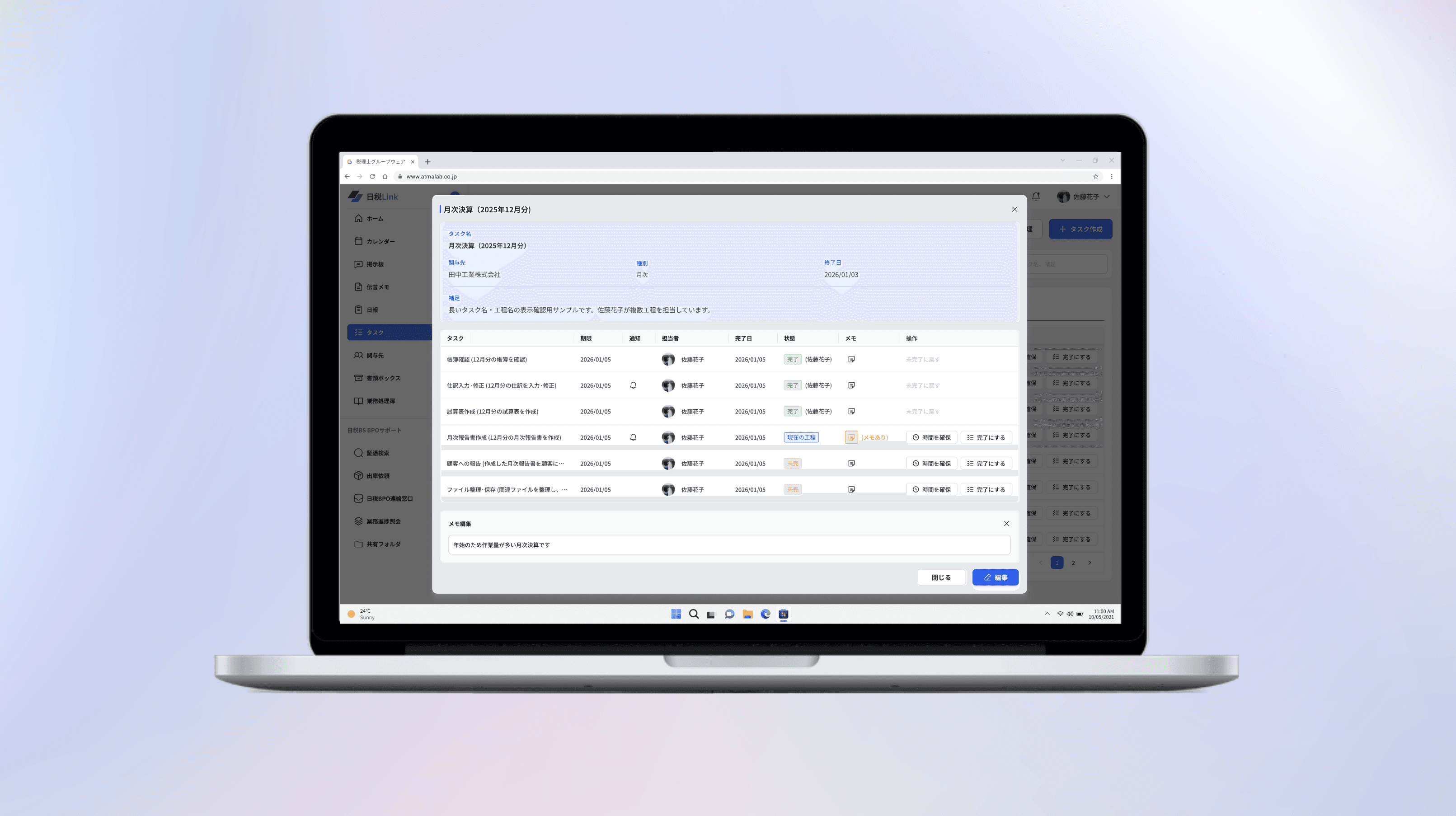
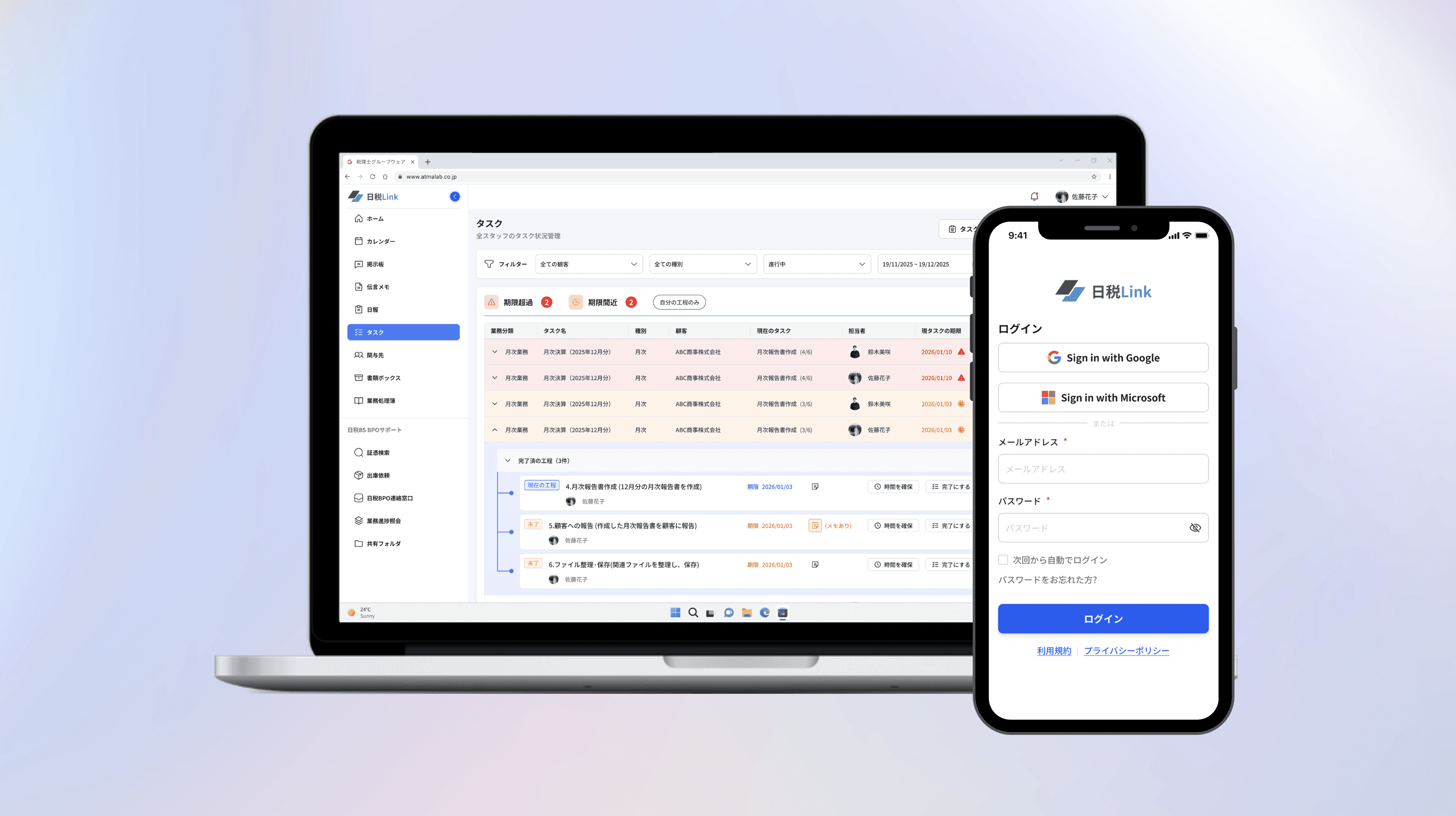
Atmalab is a groupware platform built for Japanese tax accounting firms. It consolidates daily operations — client management, tax filings, task tracking, internal messaging, and scheduling — into one system serving three user roles across desktop and responsive mobile.
I joined as the sole designer, working alongside a BA who owned the documentation, information architecture, and function specs. My role was to translate those requirements into a usable, scalable interface — and to push back with better approaches when I saw the opportunity.
CHALLENGES
Several factors made this project uniquely challenging:
The BA and client had locked the IA and core functionality before I joined. I couldn't change what the platform did—only how users interacted with it.
14 distinct flows and 300+ screens across 3 portals — each with different permissions and needs
Dense, data-heavy workflows that needed to feel intuitive without oversimplifying
Design Process
Unlike a typical end-to-end project, my workflow started with BA-prepared documentation: detailed function lists, screen inventories, and information architecture.
My job was to focus on improving usability — identifying gaps and proposing stronger design solutions across key flows.
BBS - Bulletin Board Flow
PROBLEMS
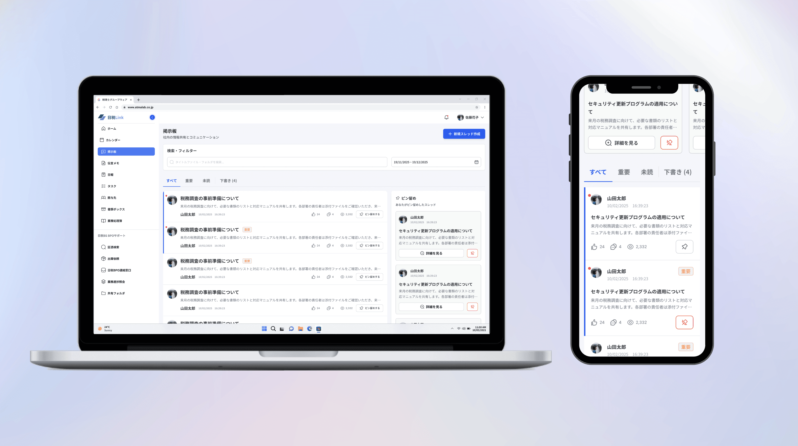
The client's prototype was a simple chronological message list with no filtering or prioritization — making it hard for tax accountants to surface urgent updates during busy filing seasons.
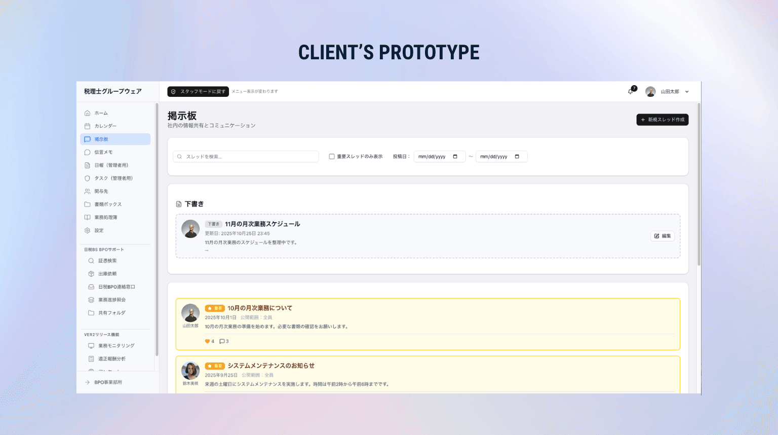
Critical compliance updates buried under routine messages
No way to quickly find unread or urgent posts
Important threads forgotten once they scrolled out of view
MY DESIGN
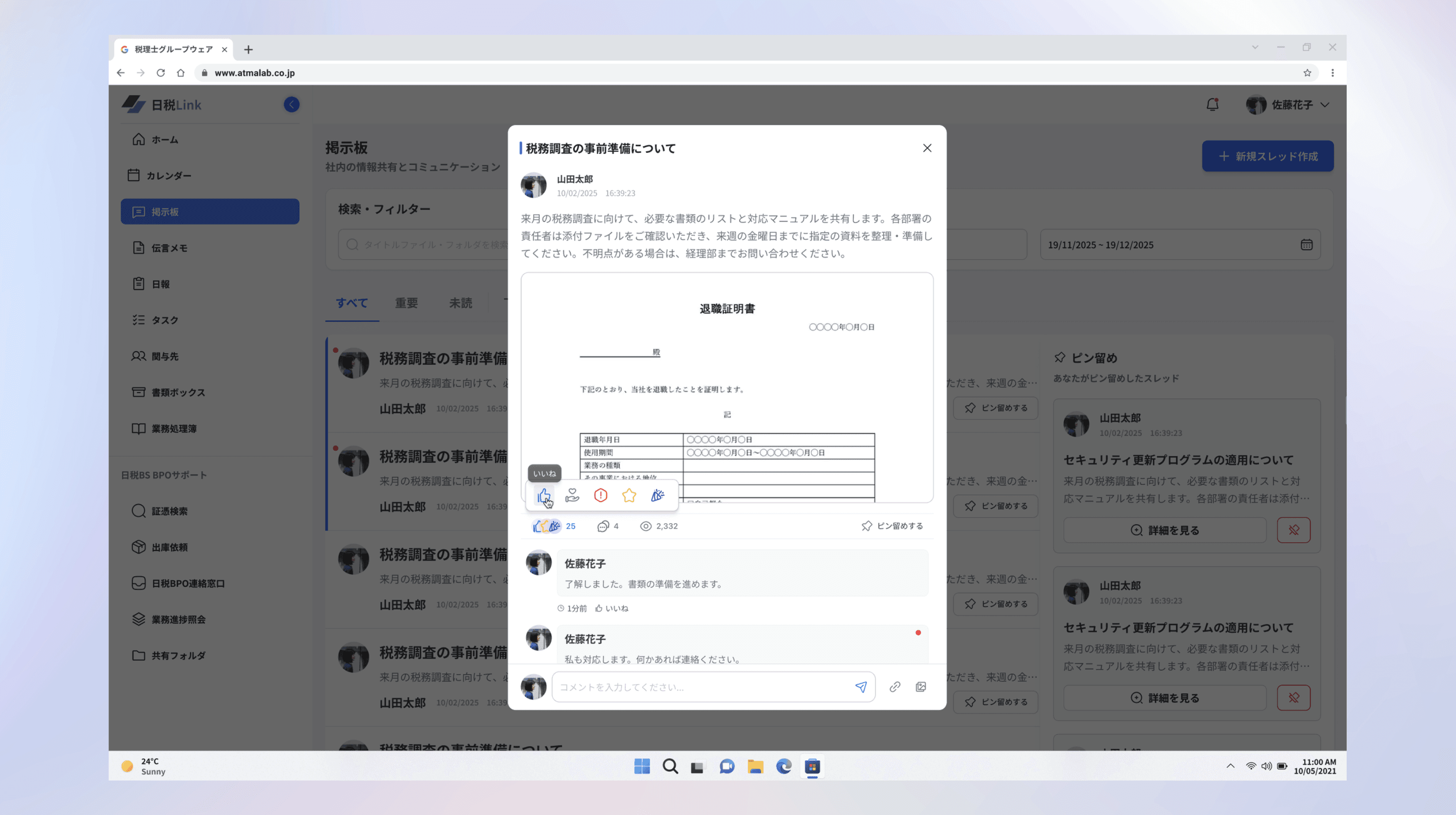
I identified three key opportunities to transform the bulletin board from a static message feed into an organized, interactive hub.
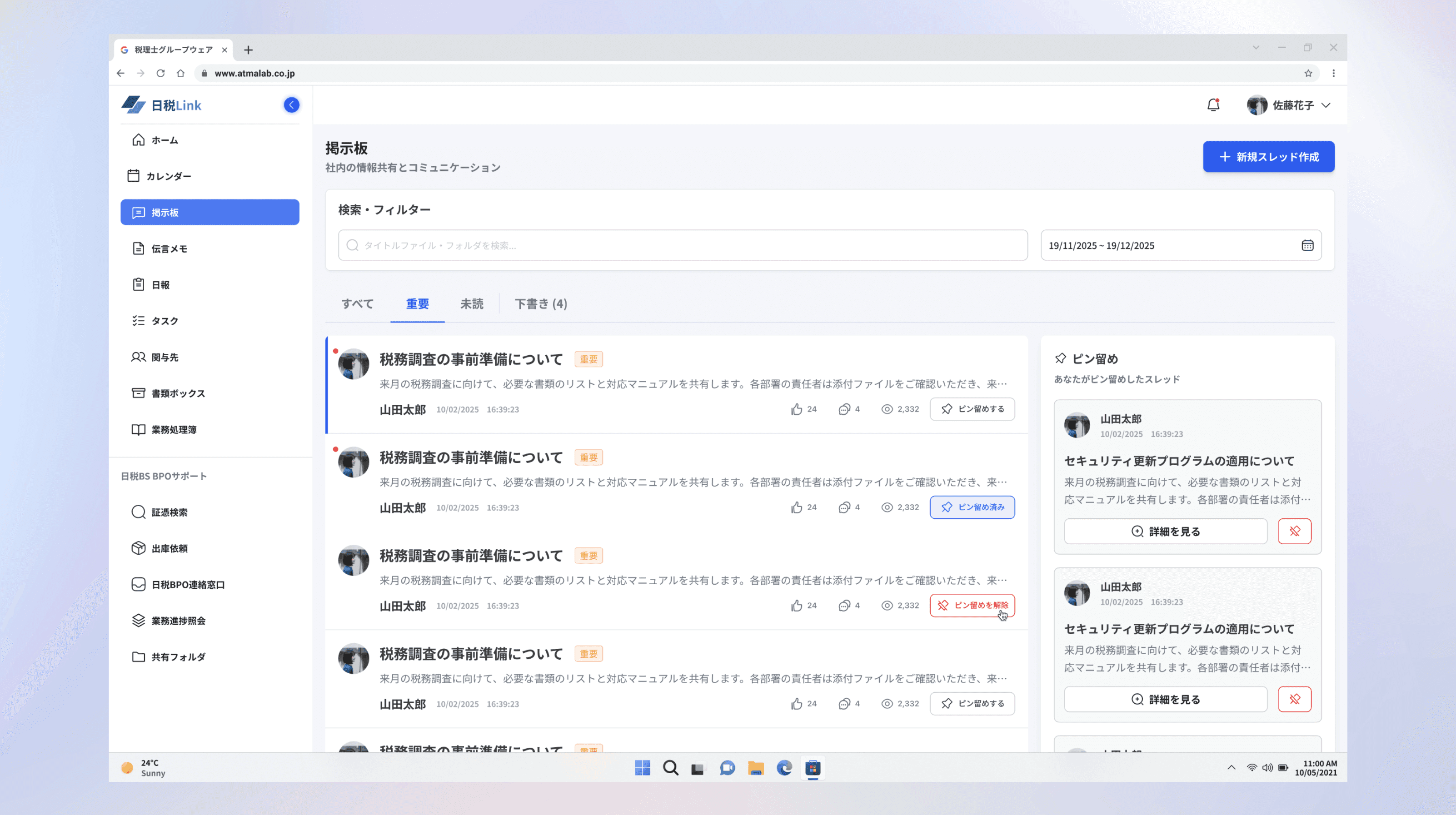
Added tab system (All, Important, Unread, Drafts) to quickly surface what matters most
Introduced pin/unpin function on each thread with a dedicated pinned sidebar for quick reference
Redesigned as a modal with emoji reactions, inline commenting, file previews, and view counts
CAL - Calendar Flow
PROBLEMS
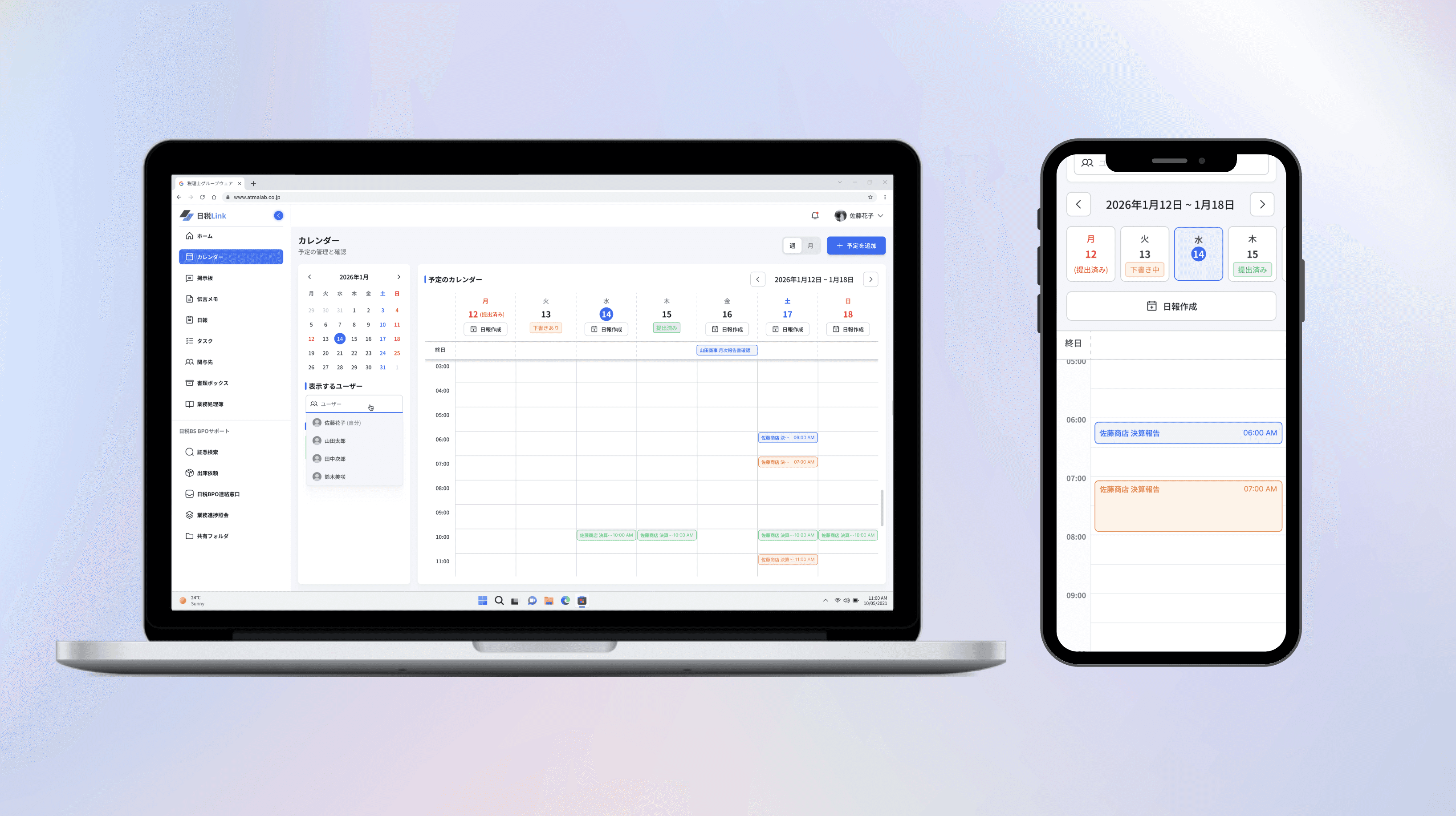
The client's prototype relied heavily on icon-only navigation with hidden functions — problematic for middle-aged tax accountants who need quick, clear access to scheduling tools during busy filing periods.
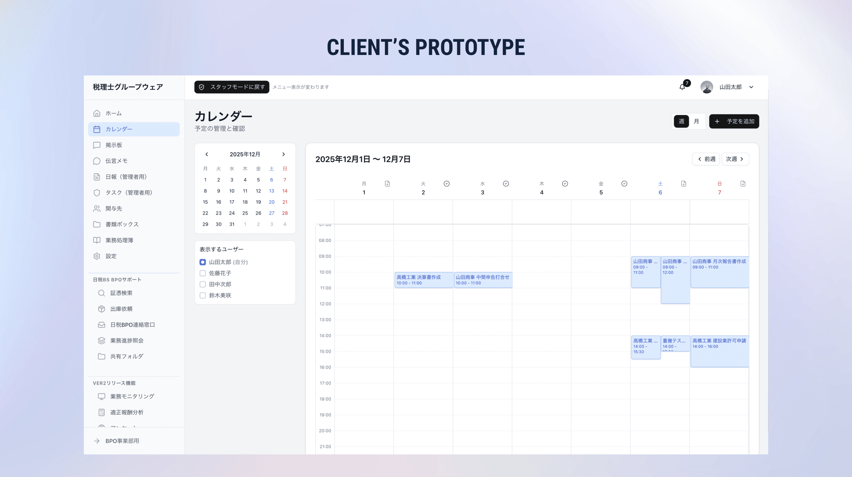
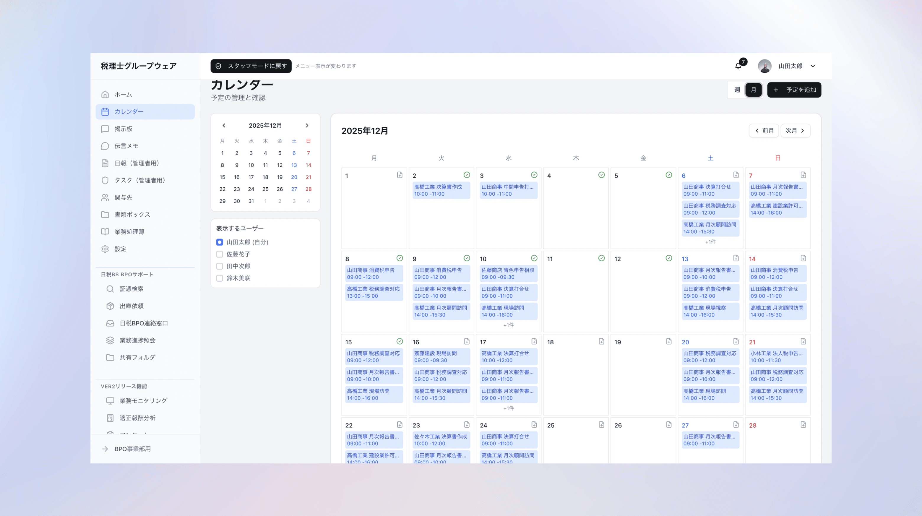
Important features buried in an icon-heavy sidebar with unclear hierarchy
No visual distinction between personal and team events
Limited event preview without clicking into each entry
MY DESIGN
I redesigned the calendar with clear navigation labels, visual filtering, and color-coded events to help middle-aged users efficiently coordinate schedules during busy tax seasons.
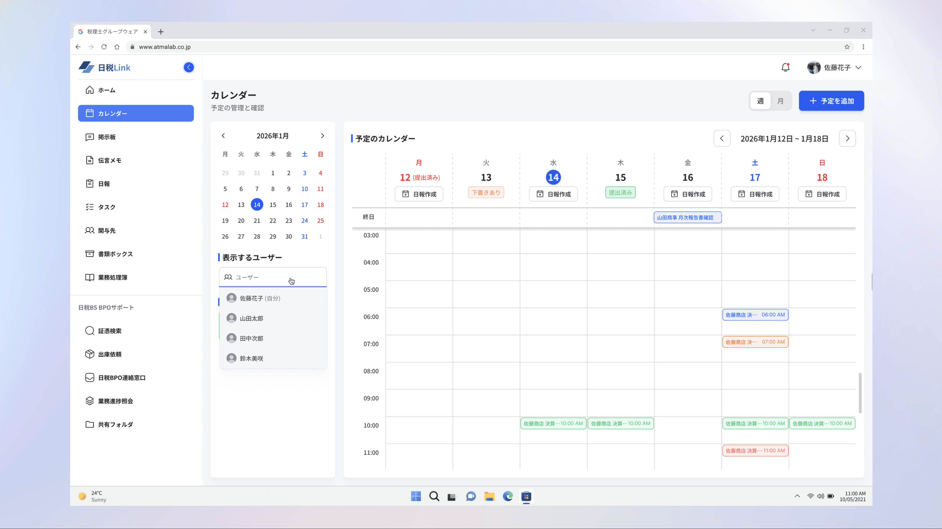
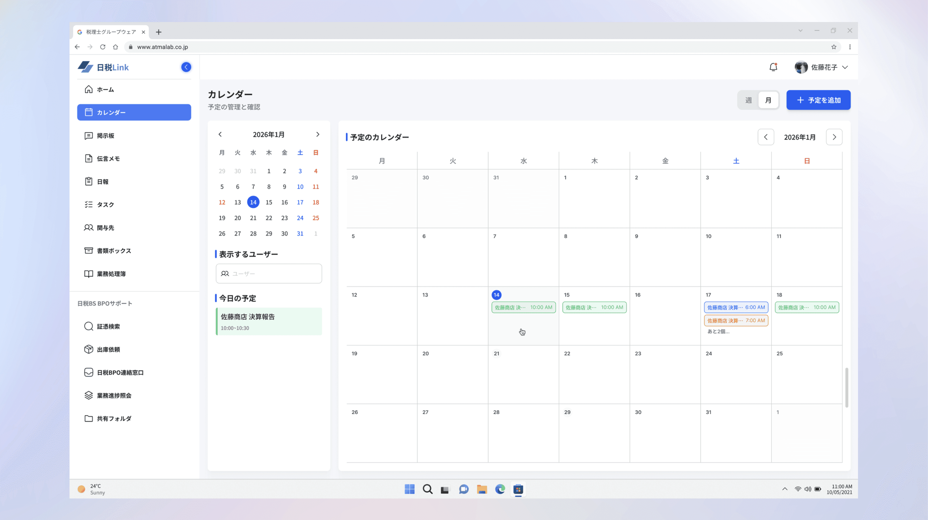
Added icon + text labels to replace icon-only navigation, making all functions immediately scannable for middle-aged users
Introduced team member filtering with dropdown and avatars, allowing users to quickly toggle which colleagues' schedules to view
Implemented color-coded event system (blue for client work, orange for submissions, green for internal tasks, red for deadlines) for instant visual scanning across the week
Enhanced event preview with detailed modals showing attendees, location, and task lists without leaving the calendar view
Mobile Responsive
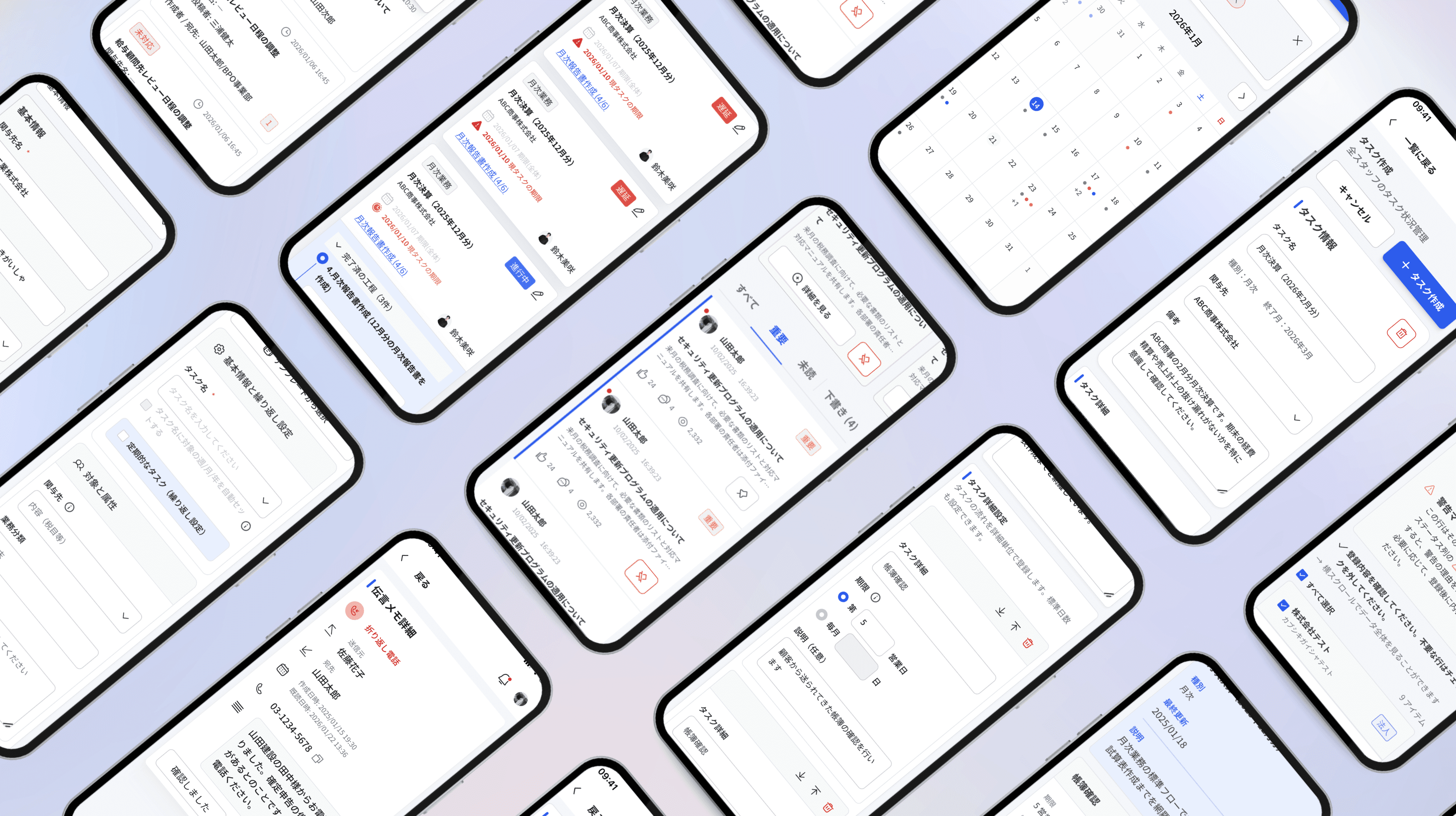
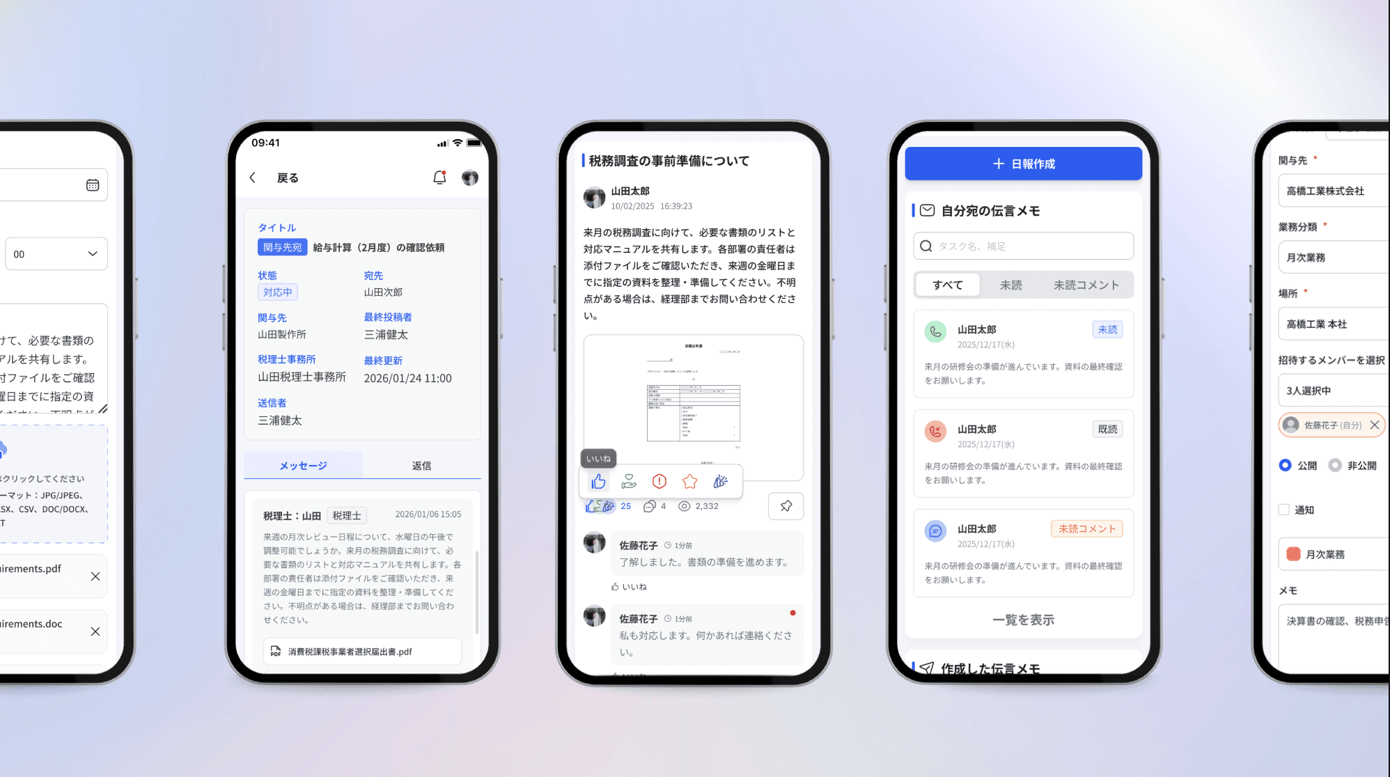
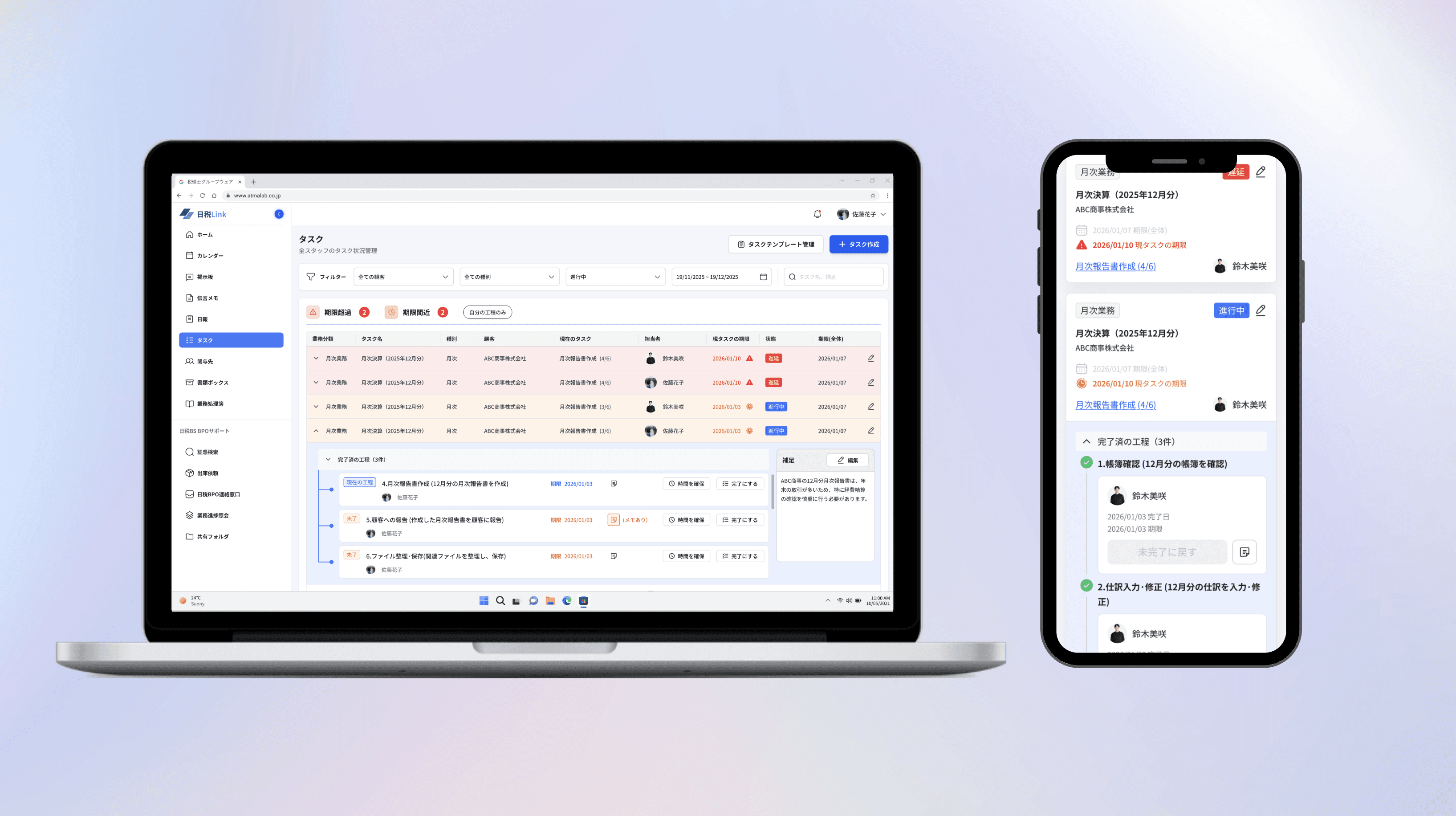
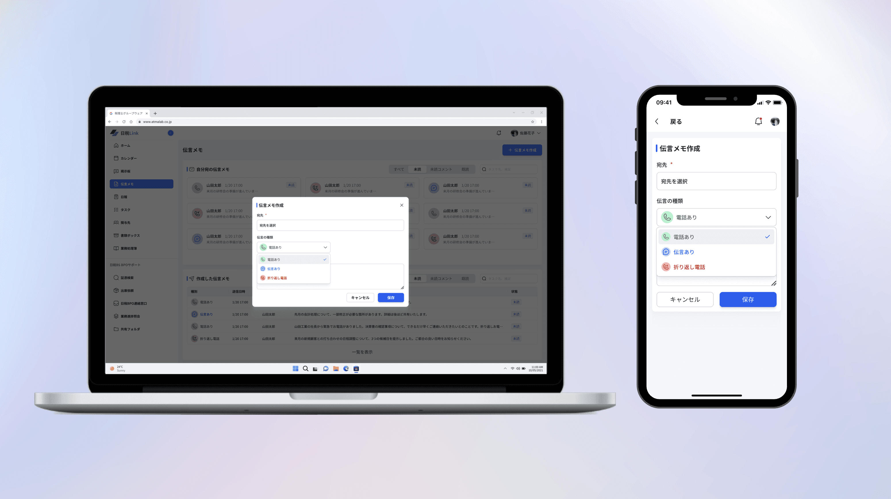
I built responsive mobile layouts for all flows, reorganizing dense desktop tables and navigation to work seamlessly on smaller screens.
Component Library
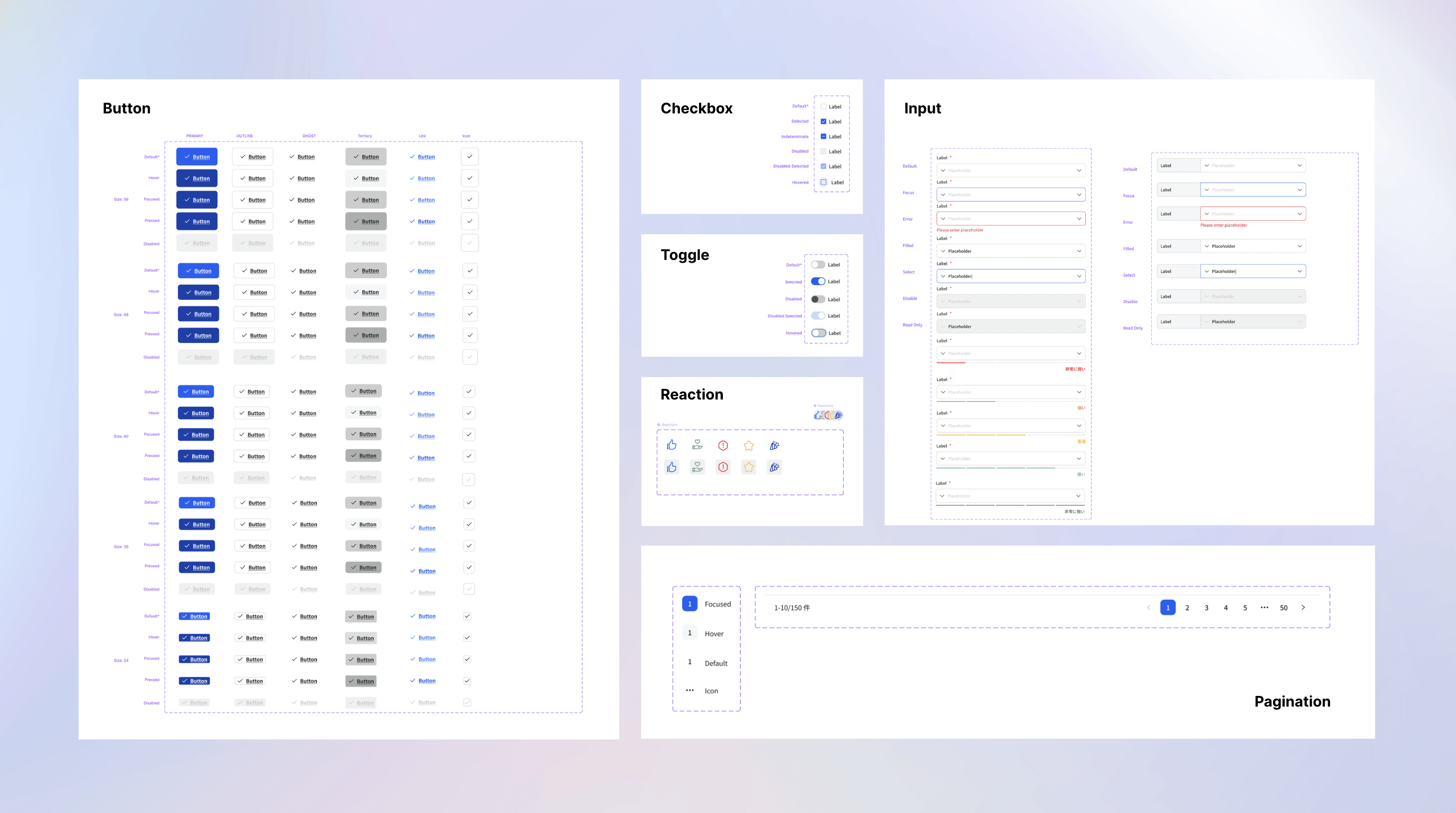
Created a component library to maintain consistency across 300+ screens and streamline design handoff to developers. (This is a preview. Contact me for more)
Key Frames
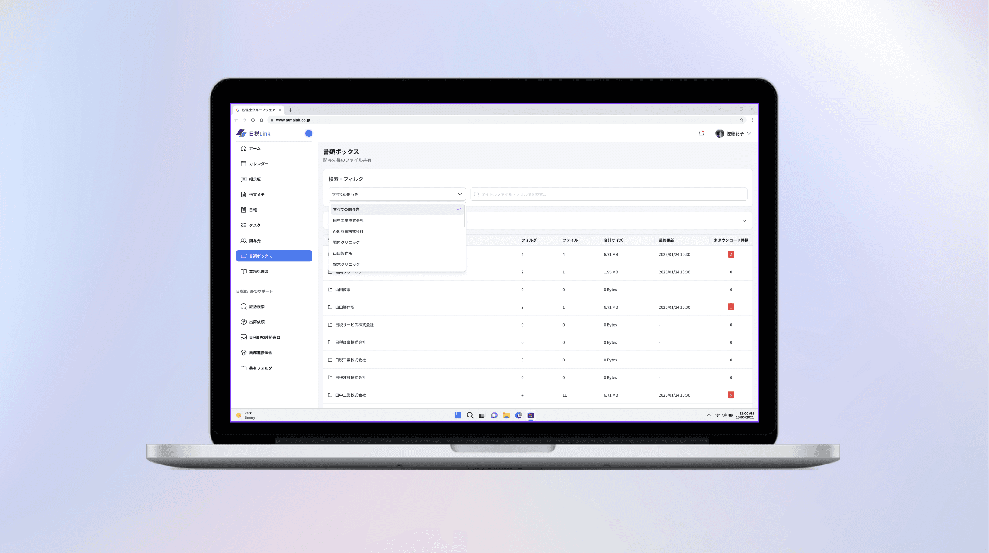
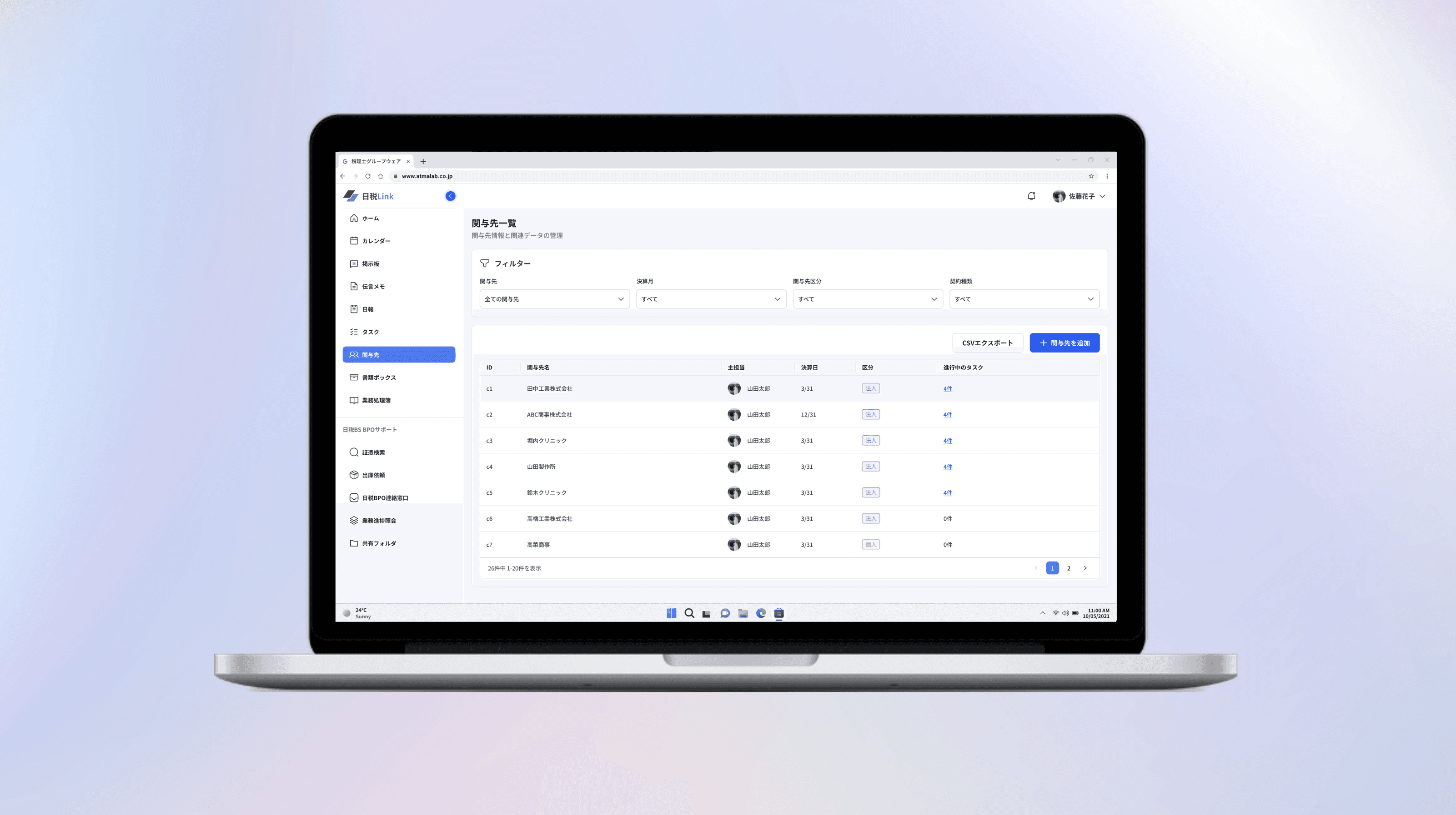
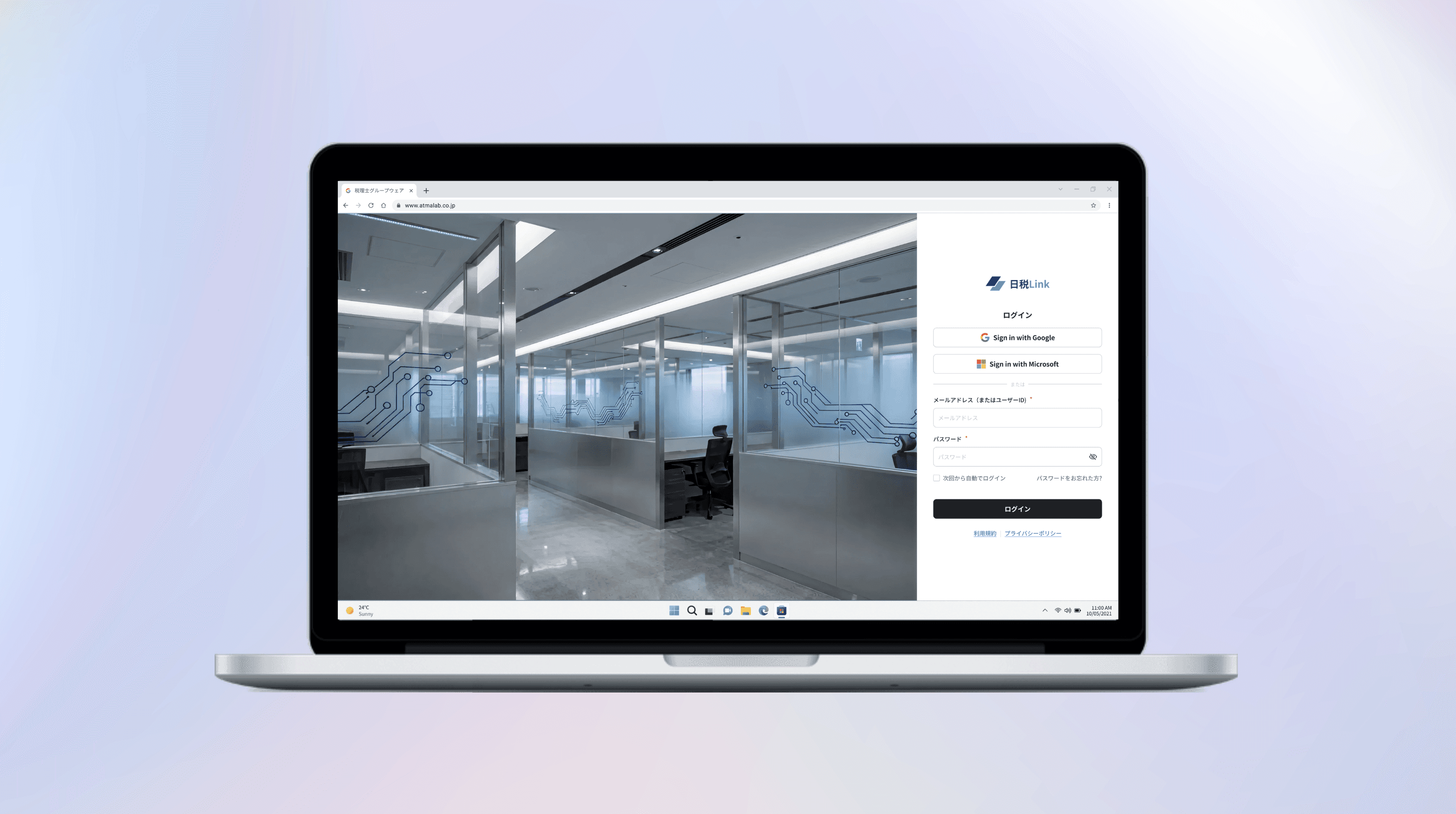
Here are a few key screens. Contact me for the complete project walkthrough.