Lugget Baggage Tracking App
Lugget is a multilingual app that helps travelers quickly find their baggage with live updates and navigation at Tan Son Nhat Airport specifically.

ROLE
UX UI Designer
TIMELINE
Sep 2025
MY LANE
User research, journey mapping, wireframes, and high-fidelity design.
CONTEXT
At Tan Son Nhat Airport, travelers often feel stressed finding the right carousel and tracking luggage. So I designed Lugget, a multilingual app, simplifies this with real-time updates, belt navigation, and quick support for a smoother, more confident experience.

USER ANALYSIS & HYPHOTHETICAL CASES
Key insights from users:
Exhausted & one-handed - Travelers juggle bags and passports, using one hand for the phone.
Connectivity gap - Offline until they join airport Wi-Fi; roaming often off.
Language barrier - Struggle with EN/VN signage; icons work better.
Flight confusion - Don’t always recall flight codes, esp. with code-shares.
Anxiety at claim - Stress rises when carousel info is unclear or delayed.
Based on what we learned, I defined the following core features that Lugget must deliver:
One-hand UI - Bottom buttons, large CTAs.
Offline fallback - Static map + 12–20 min ETA.
Bilingual + icons - EN/VN with simple copy.
Smart search - Scan boarding pass, fuzzy lookup.
Live reassurance - Belt status, countdown, micro-timeline.
Support net - Hotline + “Show screen to staff” card.
Design Process
User Journey

I mapped the end-to-end journey from landing to pickup, pinpointing friction points and anxiety triggers. This guided which features Lugget needed to surface—scan, track, navigate, and get help—keeping travelers confident at every step.
App Map

I mapped the full app flow to visualize every decision point and fallback path. This ensured travelers always had a clear next step—whether online, offline, or needing support—making the experience resilient in real airport conditions.
Wireframes

I sketched low-fidelity wireframes to explore the core flow—onboarding, scanning, results, navigation, offline fallback, and help. These quick sketches helped me validate the structure, simplify steps, and keep the focus on essential actions before moving into high-fidelity design.
Final UX Visual Design
Onboarding

Why: Travelers need to feel oriented in seconds.
Design: A simple 3-step guide with big visuals and bilingual options (EN/VN). Bright purple creates visibility in busy airport environments.
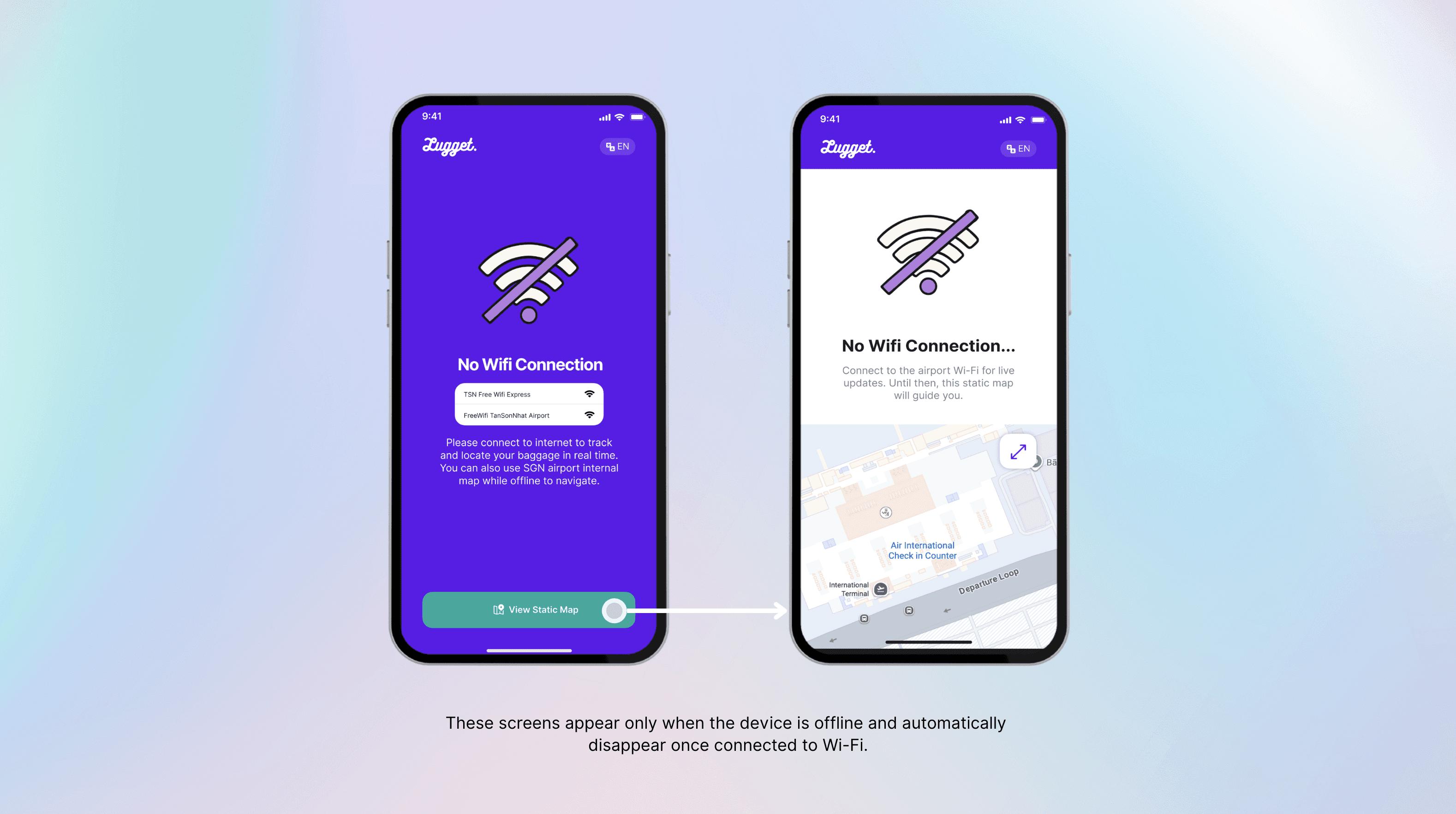
Why: Connectivity is critical but often delayed.
Design: Clear call-to-action to join Wi-Fi, with an offline fallback path. The large Wi-Fi icon signals progress instantly.
Flight Scan

Why: Flight numbers confuse passengers, especially with code-shares.
Design: Boarding pass OCR as the default, with manual input and airline logos as backup. Minimal fields reduce errors and speed up entry.

Why: Travelers want certainty about when and where their bags will appear.
Design: Bold belt number cards, high-contrast typography, and a micro-timeline showing each stage (“Landed → Belt assigned → On belt”). Vibrations and toasts give reassurance without constant checking.
Navigation & Help

Why: Large airports feel overwhelming to new arrivals & some travelers will still get stuck.
Navigation Design: Indoor map with a clear path to the belt, plus real photos of the carousel area for extra confidence.
Help Screen Design: One-tap hotline and a “Show this screen” mode with a giant belt number for staff support. Friendly illustration softens the stressful moment.
Take Away
Lugget wasn’t just about tracking bags—it was about reducing stress for travelers at their most anxious moment. By focusing on real pain points—language barriers, offline gaps, confusing navigation—we designed an app that delivers clarity and reassurance. The result is a simple, inclusive tool that helps travelers feel confident the moment they land.


